
brand style guideWelcome to the do’s & don'ts of the Beloved Arise brand.
These guidelines have been created to ensure that everyone representing our brand does so consistently and effectively. By following the standards outlined here, you’ll help maintain the integrity of our brand across all platforms and communications.
You’ll find clear instructions on how to use our logo, colors, typography, imagery, and tone of voice. By adhering to these guidelines, you’ll help strengthen our brand’s recognition and reputation. These rules are essential to creating a cohesive experience for our audience, so it’s important to apply them in every project, no matter the size or scope.
Please use this document as a resource to guide you in upholding our brand’s identity and values.
Beloved Arise is the first national organization dedicated to empowering youth to embrace both their faith and their queer identity. We are a movement to fight for the lives of LGBTQIA+ youth, particularly those who exist in the margins of their faith communities.
Beloved Arise is a multi-faith community that celebrates and embraces queer youth and young adults from all faith traditions. We uplift and empower LGBTQ+ young people in all spiritual beliefs, identities, expressions, and aspirations.
Learn more at belovedarise.org/about ↗


brand identityOur tone of voice
Our language is inclusive and affirming, ensuring queer youth of faith feel seen, welcomed, and valued. We prioritize an empathetic, empowering tone that fosters positivity and hope, especially for LGBTQ+ youth of faith. This approach creates a safe and uplifting space for all. When sharing faith-specific content, we use language that speaks directly to that community, while broader messages are carefully crafted to resonate with multiple faith backgrounds. This intentional approach ensures our posts are clear, relevant, and welcoming to everyone who encounters them.
Example 01
No matter who you are or where you come from, you deserve to feel seen, loved, and valued. We’re here to remind LGBTQ+ youth of faith that they belong, always.
💖✨ #YouBelong #LGBTQFaith #BelovedCommunity
😊
Why it works:
Inclusive, affirming, and uplifting language
Directly speaks to the audience with positivity and hope
Uses relevant hashtags to increase reach and engagement
Matches the tone of your brand, making everyone feel welcomed
Example 02
We accept all kinds of people, even if you’re a bit different. #DiversityMatters
🙁
Why it doesn’t work:
The phrase "even if you’re a bit different" is condescending, implying that being different is something to tolerate rather than celebrate
It creates a sense of “otherness” rather than true inclusion
The hashtag "#DiversityMatters" feels disingenuous in this context, as the caption doesn’t reflect genuine support for diversity.
Key elements of tone guidelines
-
The tone should be inclusive, warm, and uplifting, affirming the identities of LGBTQ+ youth while acknowledging their faith. Use language that reassures and celebrates their unique experiences.
Do: “You can live a life of purpose, faith, and authenticity.”
Don’t: “It can be hard, but you’ll figure it out eventually.”
-
Emphasize messages of hope, encouragement, and empowerment. The tone should reflect optimism, reinforcing that LGBTQ+ youth can find strength in both their identity and faith.
Do: “Your faith is a source of love and strength, just like you.”
Don’t: “Religion doesn’t matter as much as being yourself.”
-
Acknowledge and respect the intersection of faith and LGBTQ+ identity. Use language that honors their religious beliefs while promoting inclusivity. Avoid dismissive language toward faith or making assumptions about specific beliefs.
Do: “Wherever you are in your faith and identity, you belong here.”
Don’t: “We accept you, even if your journey isn’t clear yet.”
-
The tone should be open and welcoming, free from judgment or condescension. Invite everyone into the conversation with an attitude of acceptance, regardless of where they are in their faith or identity journey.
Do: “Wherever you are in your faith and identity, you belong here.”
Don’t: “We accept you, even if your journey isn’t clear yet.”
-
Reflect empathy and deep understanding of the challenges LGBTQ+ youth of faith may face. The tone should be sensitive and compassionate, offering support without minimizing their struggles.
Do: “We know the road can be difficult, but we’re here with you every step.”Don’t: “Everyone struggles, it’s just part of life.”
-
Use an approachable and authentic voice that resonates with LGBTQ+ youth. Avoid overly formal or distant language, and strive for a tone that feels relatable and genuine.
Do: “You are not alone, and your story is worth celebrating.”Don’t: “We all have challenges, but we must stay strong.”
logo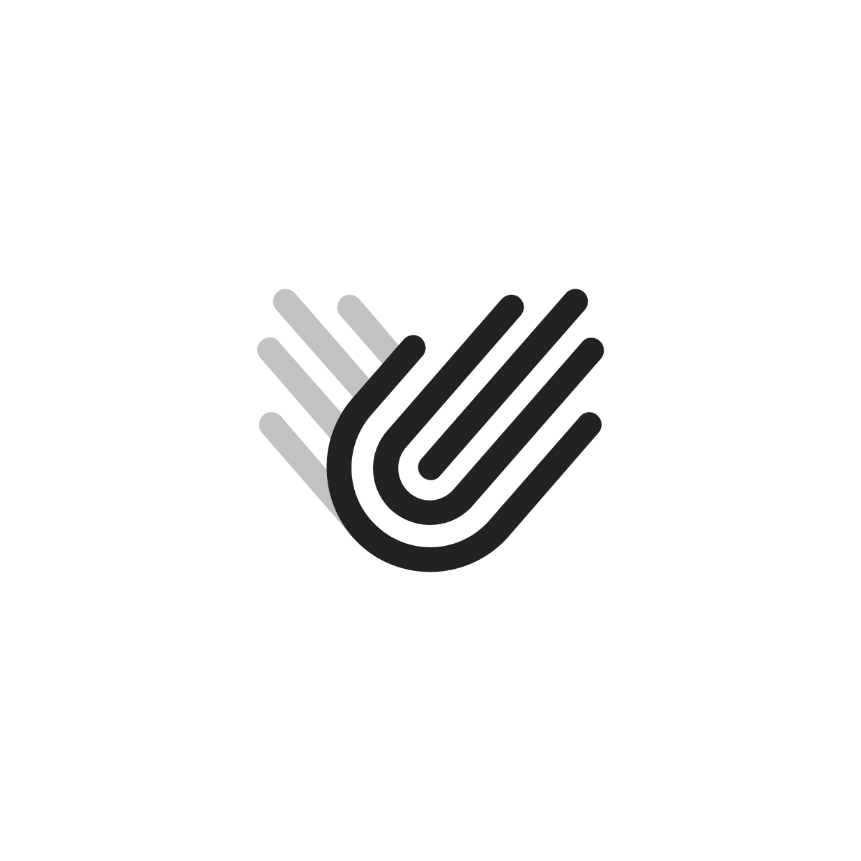
Logo Anatomy

Love
Arise


Community
Inclusivity
Logo variations
Primary
Secondary
Mark
Clear space & minimum size
Primary
Mark
40px
Logo mark Minimum size
Logo usage
The logo must appear in its black and red color format in light backgrounds and white and red or full white color format in dark backgrounds.

Logo misuse
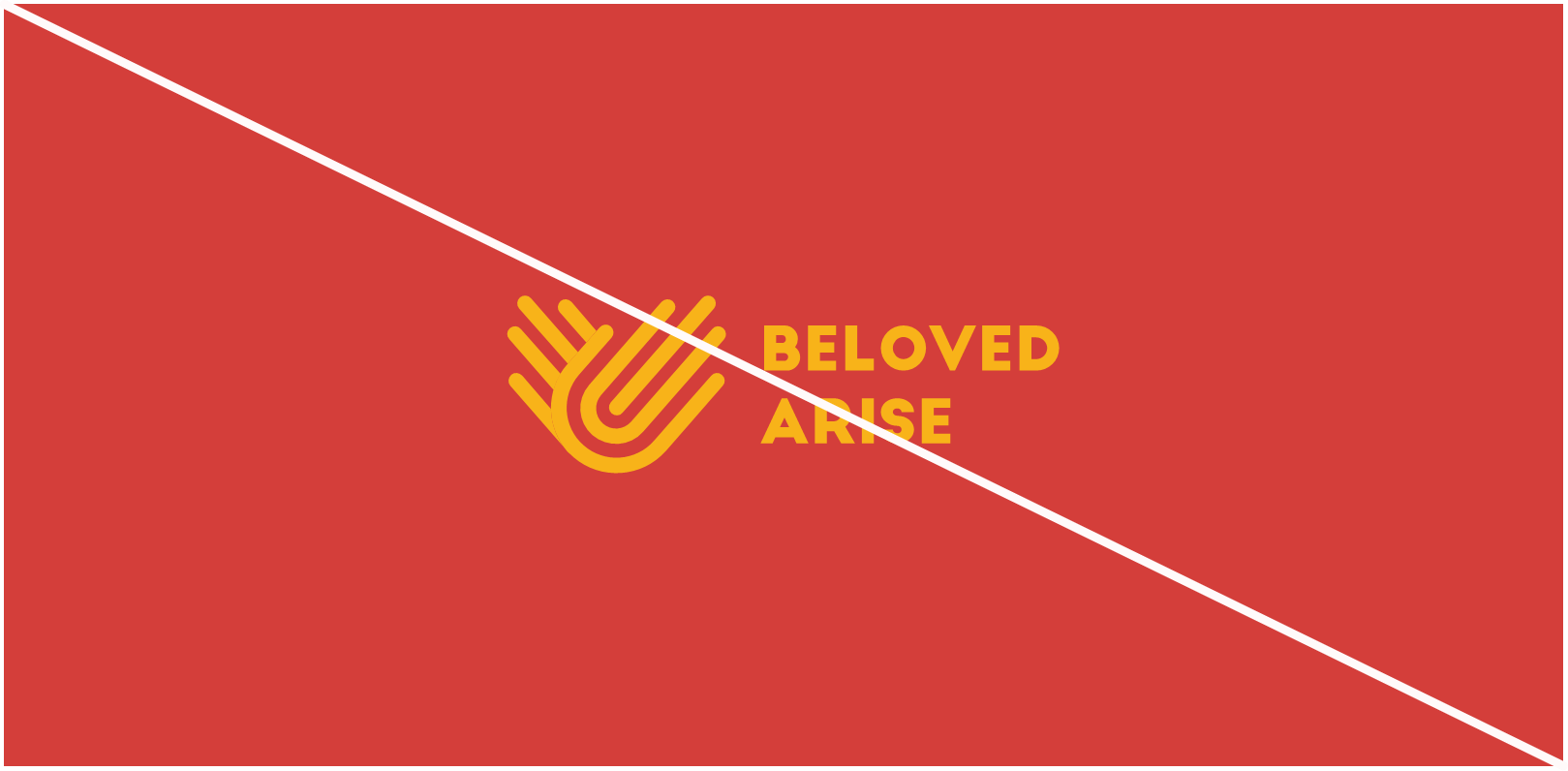
Don’t change the color of the logo

Avoid backgrounds that provide insufficient contrast

Don’t delete any elements of the logo

Don’t place the logo over busy background

Don’t add to the logo

Don’t reimage or resize any elements of the logo
colorsBA Color Palette
Primary
Red
#D43E3A
AA
Accent
Pink
#F69D8F
A
Orange
#F06530
AA
Yellow
#F7B318
A
Teal
#20AA9A
A
Dark Teal
#10554D
A
Blue
#2C88C8
AA
Aqua
#72CCD7
A
Purple
#5E65AE
A
Lavender
#9194C8
A
Neutral
Off White
#FFFAFA
A
Oil Black
#0C0C0C
A
Ivory
#F0E9E3
A
Dark gray
#222222
A
Primary & web typeface
TYPOGRAPHYUse the primary typeface for all main text across print and digital materials. It should be applied consistently in headings, body text, and any standard communication to maintain a cohesive and professional look. Digital applications should mirrors the brand’s primary font. This ensures legibility and consistency across all devices and browsers.

Secondary typeface
Use secondary creative fonts to add personality and visual flair to your designs. These fonts should be reserved for headings, subheadings, or highlighted text to complement the primary typeface. Ensure they align with the brand’s tone, maintaining readability and consistency across all materials. Avoid overusing secondary fonts—use them sparingly to enhance key design elements without overshadowing the primary font. Always prioritize legibility and cohesion to maintain a unified brand identity.


Typeface hierarchy
Follow the typeface hierarchy to maintain visual consistency and clarity across all brand communications. Always maintain consistent line spacing and margins to ensure a clean, organized appearance across all design elements.

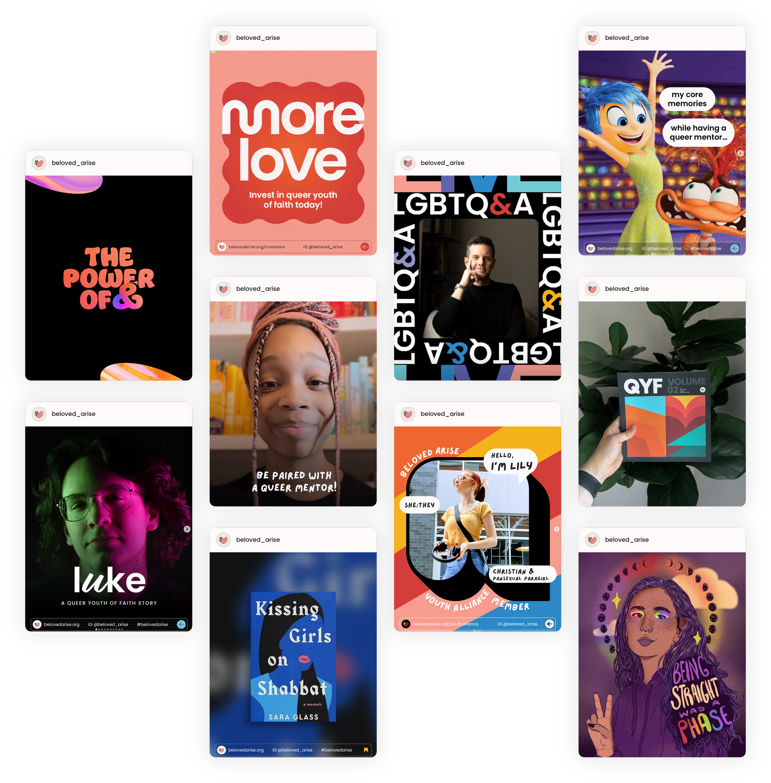
photographyBrand photography
Beloved Arise's brand photography focuses on creating a welcoming, affirming, and vibrant space for LGBTQ+ youth of faith. The imagery often features diverse young people in various joyful and supportive settings, emphasizing community, belonging, and self-expression.

design elementsArrows

Iconography


social mediaSocial Icons
These are our social media icons. Please utilize them within this color scheme to maintain a strong brand identity. The white and red logo represents our primary brand mark, while the rainbow variant is designated for use during Pride Month.


Social media profiles

Instagram story highlights

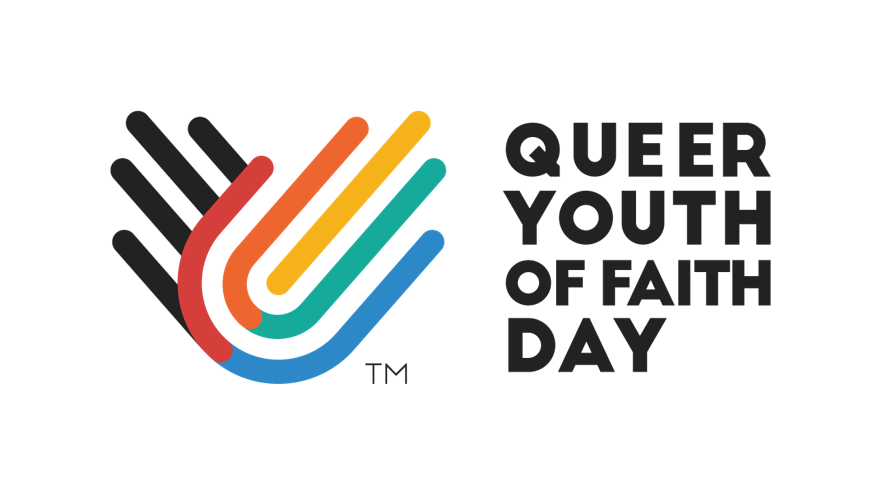
Queer Youth of Faith Day
brand applicationsQueer Youth of Faith Day (June 30) is a national day celebrating LGBTQIA+ youth across religious and spiritual traditions. The day also marks a call to action for allies to support and advocate for queer youth in their religious communities. Hosted by Beloved Arise, Queer Youth of Faith Day has been celebrated since 2020.
Merch & Apparel

Publications

LEGALGuidelines
-
Our brand is something we’ve worked hard to build, and it’s important to protect it. That’s why our logo, name, visuals, and all the content we create are covered by trademark and copyright laws. To keep everything consistent and to avoid any confusion, we ask that you only use our brand assets as outlined in these guidelines.
If you ever need to use our logo or other materials for something outside of what’s covered here, just reach out to us for approval. We’re happy to help make sure everything is used correctly and represents our brand in the best possible way.
-
We’re proud of the brand we’ve built, and we want to make sure it’s represented with care. As a member of our team or a trusted partner, you’re welcome to use our brand assets—like our logo, colors, and messaging—on approved projects that reflect our mission and values. However, if you’re unsure whether something falls within the guidelines, or if you want to use our assets in a new or unique way, we ask that you reach out for approval.
We’re here to help ensure everything stays consistent and aligned with our vision, so don’t hesitate to contact us if you need permission or guidance. We’re happy to assist in keeping our brand looking its best!
-
We’re excited to work with partners who share our values and help us celebrate LGBTQ+ youth of faith! To make sure everything we create together aligns with our brand, we’ve put together a few simple guidelines for using our logos, colors, and other brand elements.
When working with our assets, we just ask that you stick to the standards outlined here. If you want to make any tweaks or use the brand in a new way, no problem—just get in touch with us first, and we’ll be happy to review it. We’re here to help you use our brand in a way that’s positive and consistent with our mission.
Let’s make sure our collaboration stays true to the heart of what we do. If you ever have any questions, don’t hesitate to reach out!